Sometimes it is all about to presenting data in an easily understandable way. Especially when the project hasn’t started yet and you have to present the advantages offered by your office. So my boss came up to me and asked me if I can accomplish a visualization task.
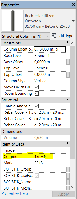
We have a refurbishment project (no digital data available like BIM models, plans,..) and I modeled every column with it’s belonging load-bearing capacity. The load-bearing capacity is the entry of the “comments” property of each object.
At first, I thought about to draw isolines of a capacity-surface but it takes too long to compute the surface. I asked Jostein Berger Olsen (http://jbdynamo.blogspot.de/) for his help and he came up with a much smarter idea. He edited my script in a way that circles would be drawn and the properties (like radius and color) depends on the load-bearing capacity. Let’s break down the whole task into some specific subtasks.
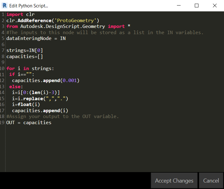
- Extract all the “comments” data out of each column
- As you can see, we have this weird way in Germany to express a decimal digit. Therefore I have to extract the string, erase the last 3 letters (whitespace+”MN”), change the “,” to a “.” and parse the string to a float/double type.
- If there is no entry, set the capacity to almost zero.
- Creating circles, where the middle points are the middle point of each column and the radius is the capacity of each column.
- Create a color range where the range is the normed range of our capacity (use of the Math.RemapRange)
- Overwrite the visibility of the circles with the belonging color-range-list.
So that’s it!
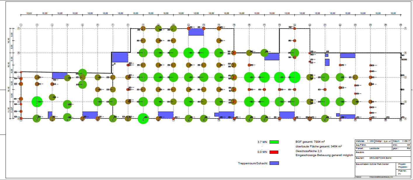
Here we have the result:

The python script:
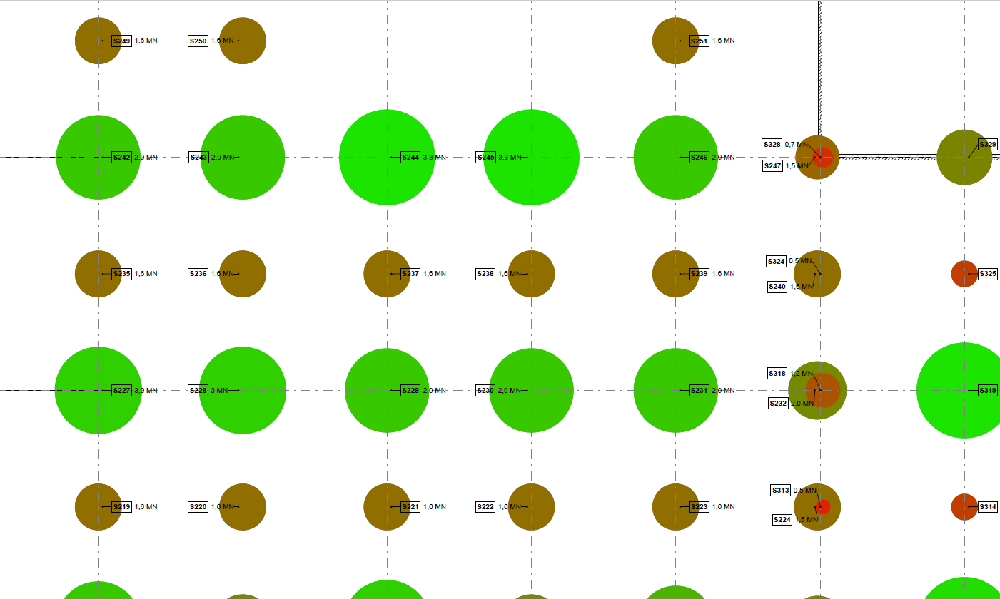
And finally the result: